Why Browsers Download Stylesheets With Non-Matching Media Queries
The other day, I read an article by Dario Gieselaar on Optimizing CSS by removing unused media queries. One of the core ideas is that you can use the media attribute when including your stylesheets like so:
<link href="print.css" rel="stylesheet" media="print">
<link href="mobile.css" rel="stylesheet" media="screen and (max-width: 600px)">
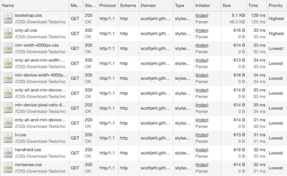
In the article, Dario links to Scott Jehl's CSS Downloads by Media Query test suite where Scott shows how browsers would still download stylesheets even if their media queries are non-matching.
I pointed out that the priority of these downloads is Lowest, so they're at least not competing with core resources on the page:

At first sight this still seemed suboptimal, and I thought that even if the priority is Lowest, maybe the browser shouldn't trigger downloads at all. So I did some research, and, surprise, it turns out that the CSS spec writers and browser implementors are actually pretty darn smart about this:
The thing is, the user could always decide to resize their window (impacting width, height, aspect ratio), to print the document, etc., and even things that at first sight seem static (like the resolution) can change when a user with a multi-screen setup moves a window from say a Retina laptop screen to a bigger desktop monitor, or the user can unplug their mouse, and so on.
Truly static things that can't change (a TV device can't suddenly turn into something else) are actually being deprecated in Media Queries Level 4 (see the yellow note box); and the recommendation is to rather target media features instead (see the text under the red issue box).
Finally, even invalid values like media="nonsense" still need to be considered, according to the ignore rules in the spec.
So long story short, browsers try to be as smart as possible by applying priorities, and Lowest is a reasonable value for the cases in Scott's test.
